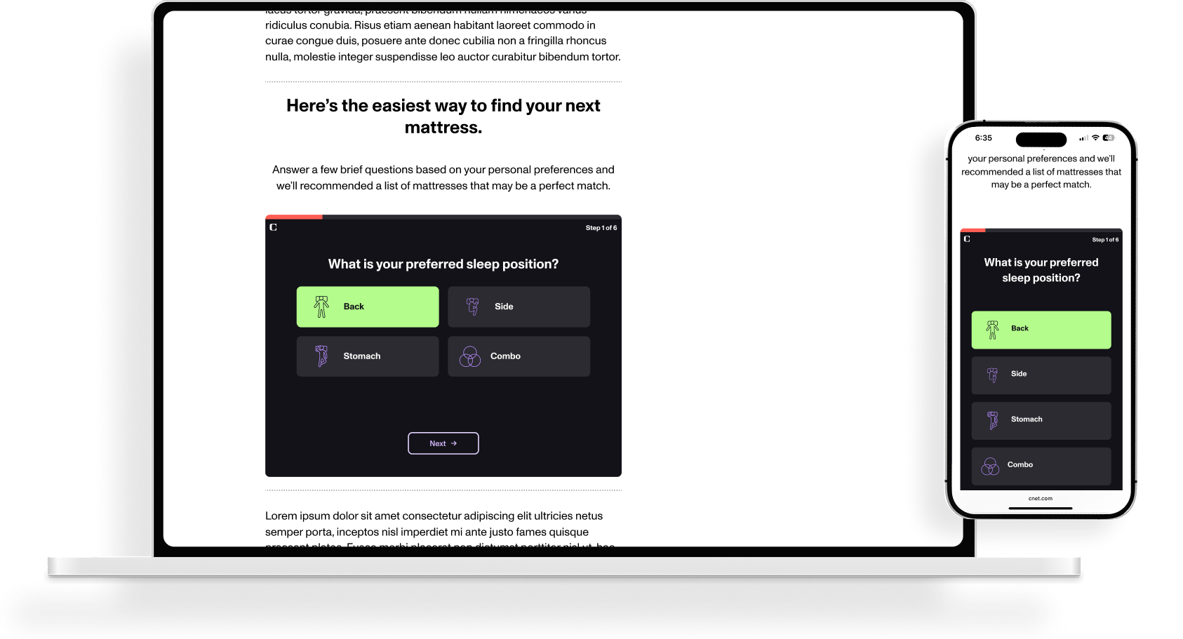
A guided sleep quiz for CNET that meets users earlier in their shopping journey and narrows them down to the right mattress through a focused set of questions, built on-brand in a dark UI that bridges editorial feel with a commerce goal.

CNET wanted to better monetize their mattress discovery content with a quiz experience that felt native to their editorial brand while serving a clear commerce objective. The challenge was making something personal feel effortless, designing a multi-step flow that asked intimate questions like sleep position, body weight, and budget without feeling clinical or intrusive, and that guided users to a confident recommendation without overwhelming them with choices.
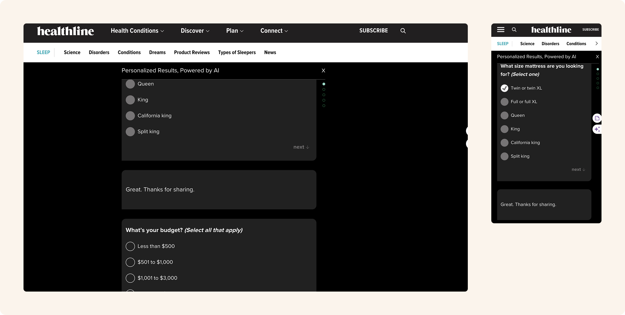
The work started with competitive research, auditing how other publishers and commerce sites handled quiz flows to understand what felt trustworthy versus what felt like a lead-gen trap. From there I moved into wireframes to nail the structure and question order before touching any visual decisions.
Once the bones were in place, I explored multiple colorways to find the right fit for the experience. The dark UI was a deliberate choice to give the quiz its own visual identity within CNET’s ecosystem, setting it apart from standard editorial content while staying on-brand. I also designed the iconography from scratch to support each question type, and worked through several options for the progress indicator before landing on an approach that kept users oriented without pulling focus from the question in front of them.
Throughout the project I collaborated closely with a project manager and content writer, with direction shaped by stakeholder feedback across multiple rounds of refinement.


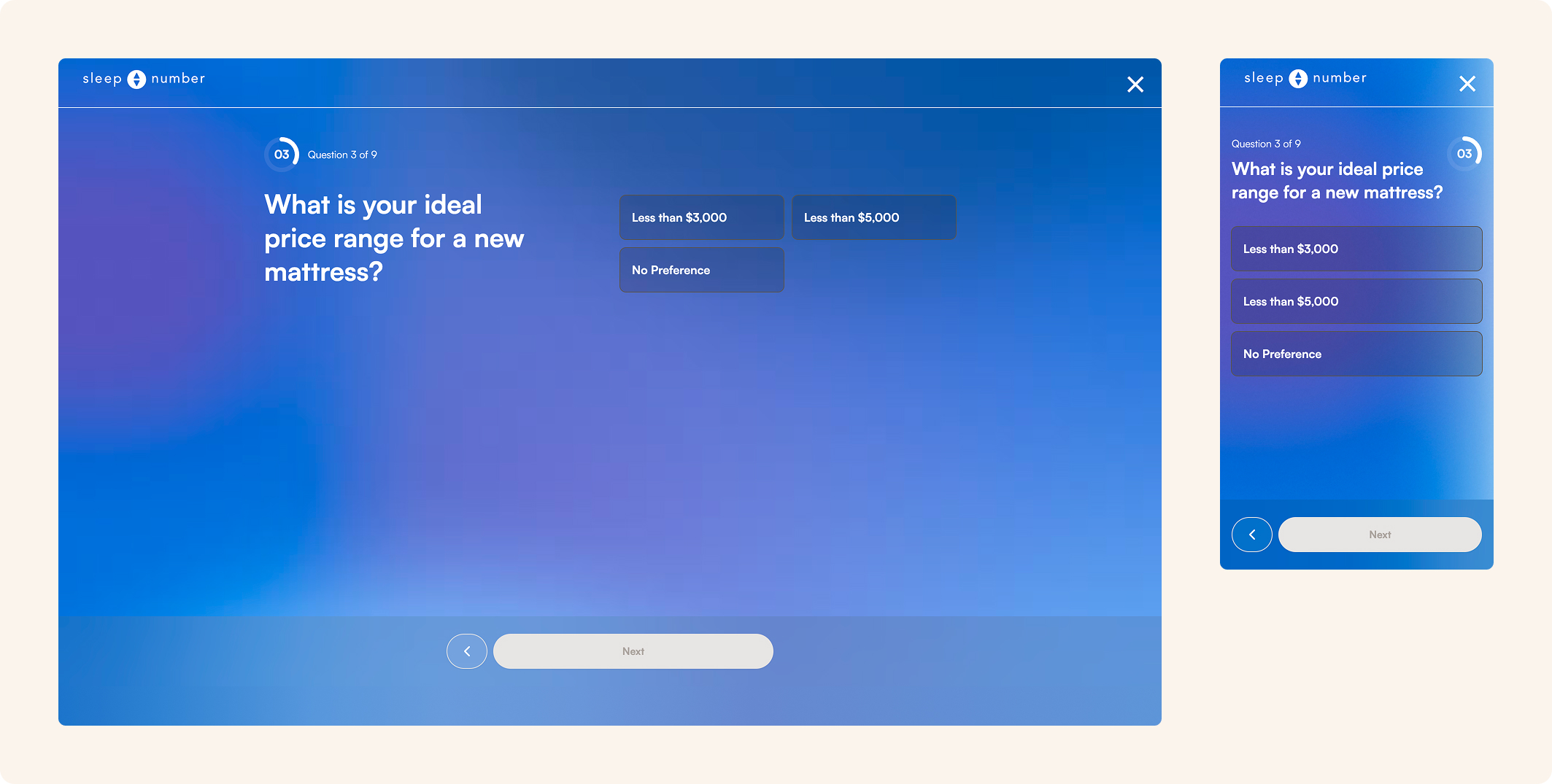
The final design is a 6-step quiz flow covering sleep position, firmness level, hot sleeping habits, body weight, budget, and bed frame type. Each question uses a consistent card-based selection pattern with custom iconography, making choices feel visual and intuitive rather than form-like. A progress indicator at the top of each screen keeps users oriented throughout the flow.
The quiz concludes with a personalized results page surfacing mattress recommendations matched to the user’s answers, with product imagery, comparison details, and direct links to purchase. An edge case screen handles users whose preferences don’t match any available recommendations, offering a fallback path rather than a dead end.
The experience was designed across desktop and mobile, maintaining the dark UI and interaction patterns at every breakpoint.
This project was an exercise in making form match function. The Editors’ Choice award means something at CNET, and the template it lives in now reflects that. The result is a page that distinguishes itself immediately, communicates trust before it asks for it, and gives recognized products the kind of presence that makes a reader want to keep reading.