
A dedicated template for CNET’s highest editorial honor, designed to give the award the presence its name implies and make the winning products impossible to miss.




CNET’s Editors’ Choice award is the publication’s highest editorial endorsement — a designation earned through hands-on testing by expert reviewers and awarded only to products that represent the best in their category. It carries weight with readers because it’s selective, rigorous, and backed by decades of credibility in consumer technology coverage. When a product earns the badge, readers trust it. The page behind that badge, however, wasn’t living up to what the award meant.

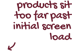
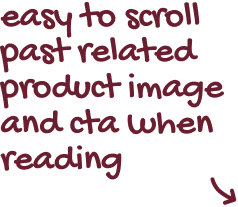
The Editors’ Choice award had no dedicated home. Instead, it lived inside a shared editorial template used across the rest of the site with no visual treatment to signal that this page was different from anything else a reader might land on. The badge itself was absent from the experience. The award criteria and what made a product eligible were buried in loosely formatted copy that was easy to scroll past. Winning products appeared far enough down the page that a reader could lose interest before ever reaching them. There was no hierarchy, no moment of recognition, and nothing to anchor a reader’s trust before asking them to engage with the content. The most trusted name in tech reviews was presenting its highest honor the same way it presented everything else.


The project started with an audit of the existing page — mapping what was there, what order it appeared in, and where readers were likely to disengage. Alongside that, a review of how comparable publications handle award templates helped establish a benchmark: what did strong versions of this kind of page do that CNET’s wasn’t doing? That research produced a clear picture of the gaps and a set of principles to design toward: lead with the award, establish credibility before products, and make the winners impossible to miss.
From there, roughly six layout directions were explored in Figma, each testing a different approach to sequencing the content and introducing the award. Some led with the badge prominently; others experimented with how to surface product winners earlier without sacrificing the editorial framing that gave them context. Feedback from stakeholders across editorial and product shaped each round of iteration — pushing toward a design that worked within CNET’s existing design system while still feeling genuinely distinct from the templates around it. The final design was built to spec with a full dev handoff, including component documentation and responsive layouts across all screen sizes.
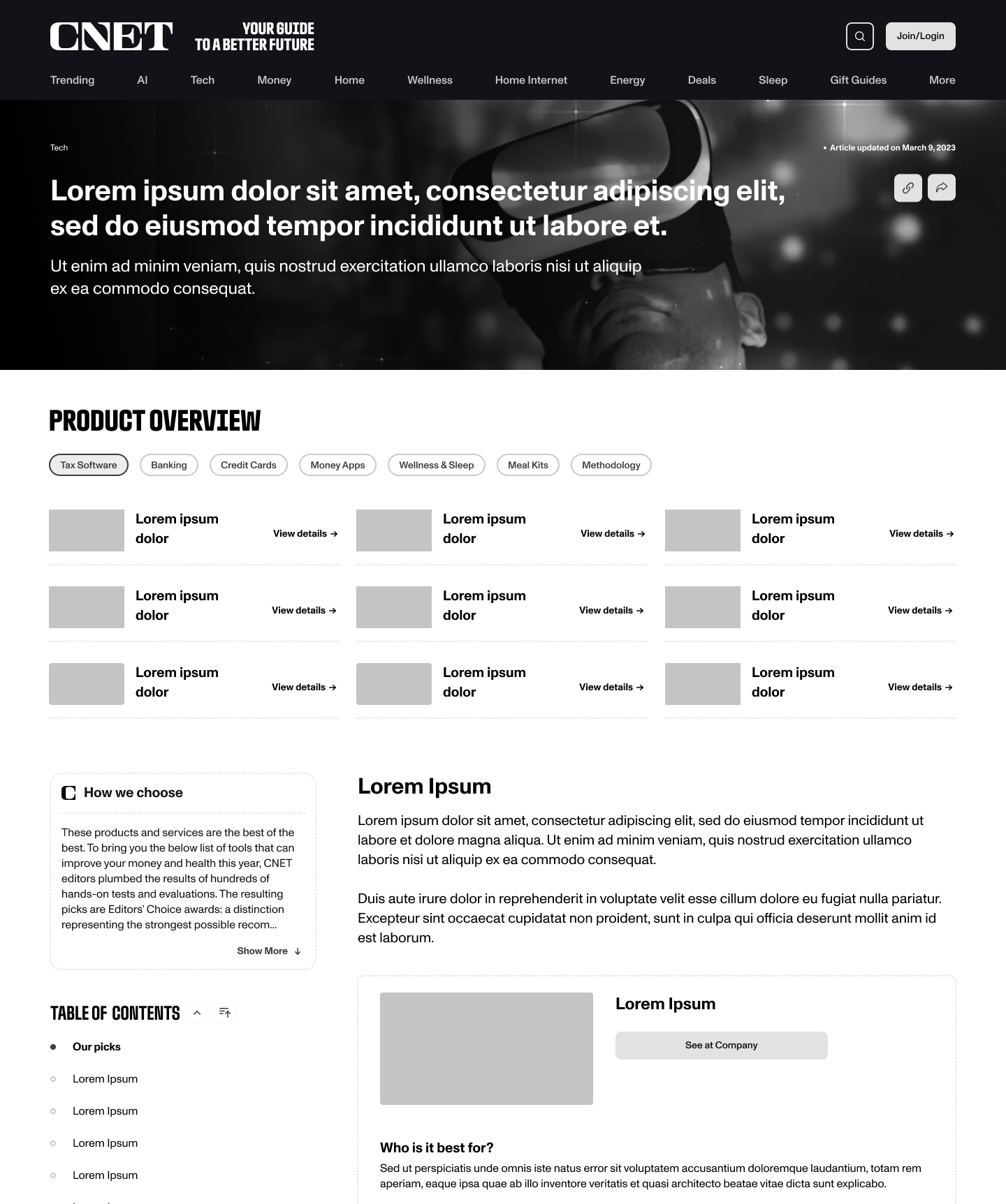
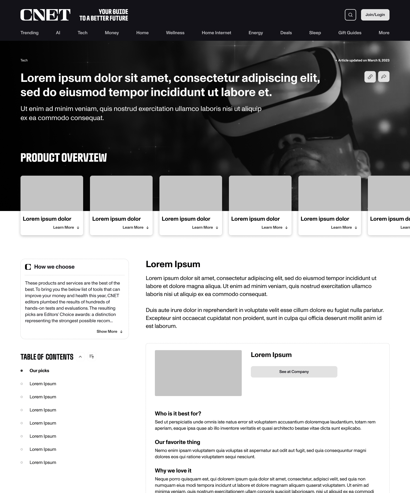
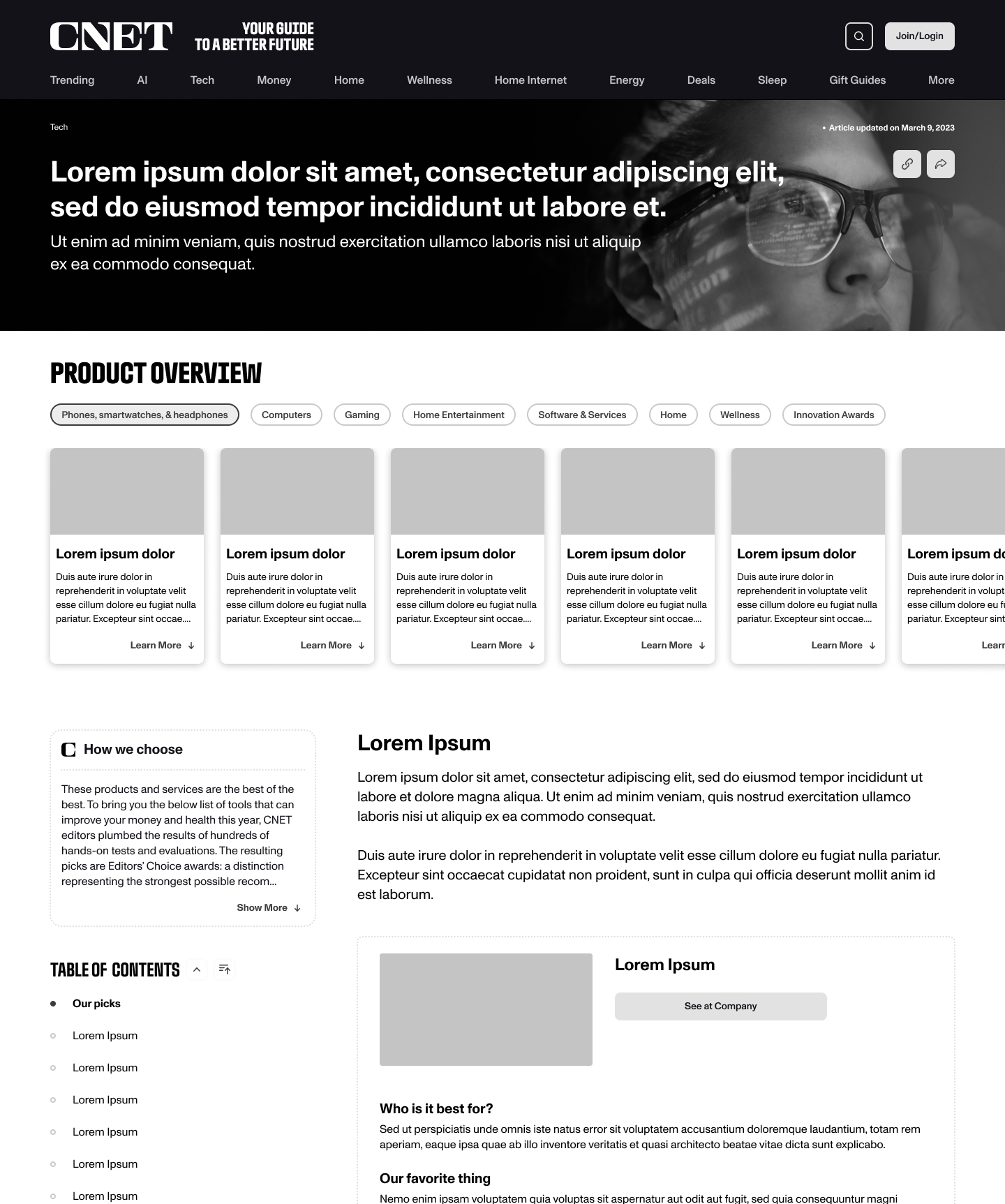
The redesign replaced a shared editorial template with a page built specifically around the award. Leading with the honor’s criteria before the products reframed the reader’s experience, and a structured winners showcase made the recognized products easier to scan and trust. The result is a page that earns the reader’s attention before asking for it.


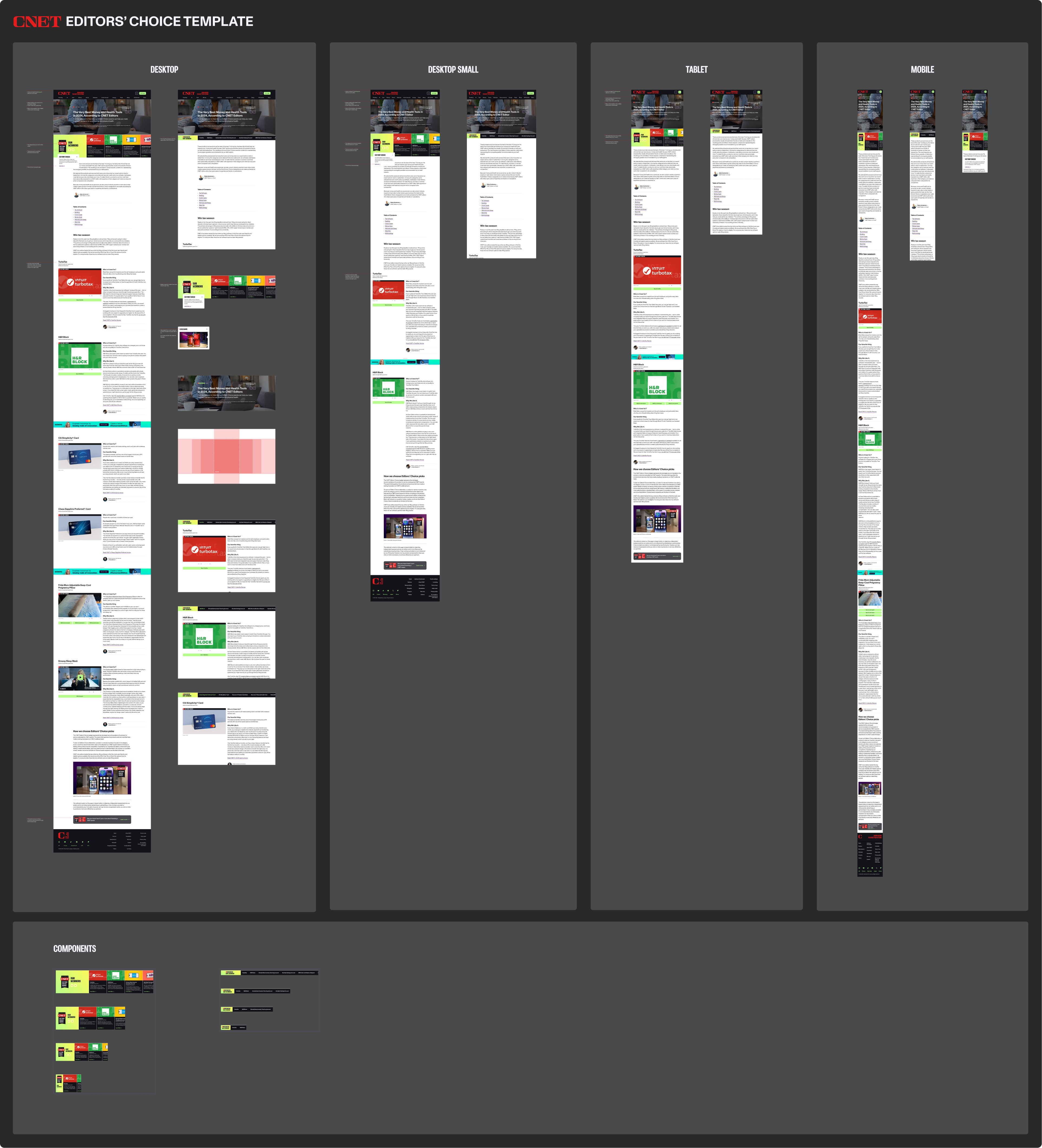
This project was an exercise in making form match function. The Editors’ Choice award means something at CNET — the template it lives in now reflects that. The result is a page that distinguishes itself immediately, communicates trust before it asks for it, and gives recognized products the kind of presence that makes a reader want to keep reading.